Notion Charts: Amazing Feature You Need to Know (Step-by-step Guide 2024)
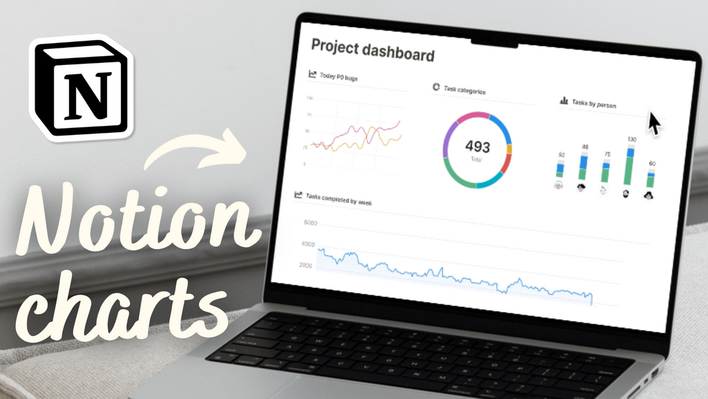
Notion recently launched a major update on chart functionality, and it is a game changer! Visualizing data with charts and graphs can help you understand trends in large datasets and analyze insights better. In this article, we'll dive deep into how to use charts and the best practices for them.
1. Create Charts in Notion
There are three main methods to create a chart view in Notion. Depending on the context and your specific needs at a given moment, one method might be more suitable than the others.
- Create an In-Line Calendar Database in an Empty Page: Begin with an empty Notion page, type '/Chart', and then click on the type of chart you want to use.

- Using an Existing Chart View Database: If you already have an existing database in Notion, you can add a chart as a linked view database. All you have to do is type "/linked view of database" and select the correct database that already is in a table view. Any changes you make here will be reflected in the main database. We recommend using an existing database as charts excel at visualizing your data
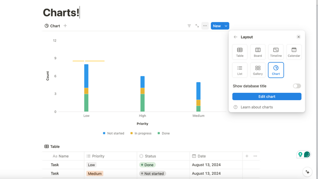
- If you want to convert a different type of database into a Chart view, hover over the setting, go to the three dots, select “Layout”, and convert it into a Chart.
2. Choose your Chart Types
When creating a data presentation, it is crucial to select the appropriate chart types to effectively communicate your message. There are four types of chart options available in Notion, each suited for different types of data and analysis.
Vertical Bar Charts
Vertical charts work best when you need to categorize datasets, identify trends, and make quick comparisons. For example, you can use vertical charts to show the number of tasks at each priority level across different projects. By seeing how tasks are distributed, you can quickly determine where more resources or attention might be needed.

Horizontal Bar Charts
Similar to vertical bar charts, which emphasize the comparison of quantities across categories, horizontal bar charts are particularly useful for accommodating lengthy category names and making comparisons across multiple categories more visually accessible.
Horizontal ****bar charts are recommended for showing additional properties rather than time-based data. You can display the number of tasks in each priority and their completion status. This allows comparing two different properties within the same chart.

Line Charts
Line charts are excellent for showing data over time. For instance, you can display how many tasks appear each day or group tasks by priority allows seeing how many tasks are low, medium, or high priority on specific days.

Donut Graph
Donut charts are a powerful tool to visualize parts of a whole and show proportions or percentages of categorical data. You can use a donut chart to display the distribution of tasks by team members or to allocate your budget, showing how much is being spent on various categories.

3. Display Data in Your Chart
Choosing the right variables for these axes can greatly impact the clarity and effectiveness of your data visualization.
A donut graph has a simple setup to display data; you only need to consider what the whole donut will represent and what each slice represents. On the other hand, when creating a vertical bar chart, horizontal bar chart, or line chart, you need to select what to display on both the X and Y axes. For instance, the X-axis might represent time periods, categories, or other sequential data, while the Y-axis could represent numerical values, frequencies, or percentages.
4. Style Your Charts
Different charts offer various styling options. These customizations let you adjust the appearance of your charts to better fit your data presentation needs and aesthetic preferences.

There are also many other styling options, such as changing the size of the chart, group style, showing percentages, modifying the grid line, and toggling on or off the legend and data labels.

5. Export Charts
Charts can be exported as PNG or SVG files. You also have the option to change the background color to better fit the design or aesthetic requirements of your project.

How much is Notion Charts?
If you are on the free plan, you are allowed one chart per workspace. This means if you’ve used up your one chart, you won’t see any charts in duplicated templates. However, you can create, export, and then delete charts to stay within the free plan limitations.
On the other hand, the paid plan offers unlimited charts, making it easier to dynamically visualize your data with multiple charts.
Excited to learn more about Notion Charts?
If you want to learn more through real-life examples, we strongly recommend watching our tutorial for a comprehensive, step-by-step video guide on making the best out of this functionality in Notion. To learn more about Notion Charts, read Notion’s Official Guide here.