10+ Best Tips to Create Gallery in Notion | Step-by-Step Tutorial (2024)
Share

Adding visual galleries in Notion can make your workspace feel more personalized and interactive! From team directories and mood boards to brand assets, Notion can make it all work aesthetically for you!
In this article, we will cover the best tips for using the gallery view in Notion. These tips will help you structure and organize your information while also making it look aesthetically pleasing. By following them, you can make the most out of Notion's gallery view feature, making your data both appealing and easy to navigate. Whether you're a beginner or an experienced user, these insights will enhance your productivity and clarify your information presentation. So let’s dive in!
Tip 1: Master Four Ways to Create Timeline Databases in Notion
There are three main methods to create a gallery view in Notion. Depending on the context and your specific needs at a given moment, one method might be more suitable than the others.
- Transform an Empty Page into a Gallery Database: If you're already working on a page that you'd like to convert into a database, go to the three dots at the bottom of the page, and click on 'Gallery'.
- Create an In-Line Gallery Database with an Empty Page: Begin with an empty Notion page, type '/Gallery', and then click on 'Gallery View'.
- Using an Existing Gallery View Database: If you already have an existing database in Notion, you can add gallery as a linked view database. All you have to do is type "/linked view of database" and select the correct database that already is in a table view. Any changes you make here will be reflected in the main database.
If you want to convert a different type of database into a gallery view, hover over the setting of the database, go to the three dots, select “Layout”, and convert it into a gallery. Note that this won't show entries unless the database has image properties.

Tip 2: Know the Application of Gallery View
Gallery views can be used in many ways, such as displaying journal covers, organizing projects, and creating visually appealing photo galleries. They are particularly useful for showcasing the cover photo of a page prominently before the viewer decides to open it.
Here are some examples of the most common applications for Gallery View:
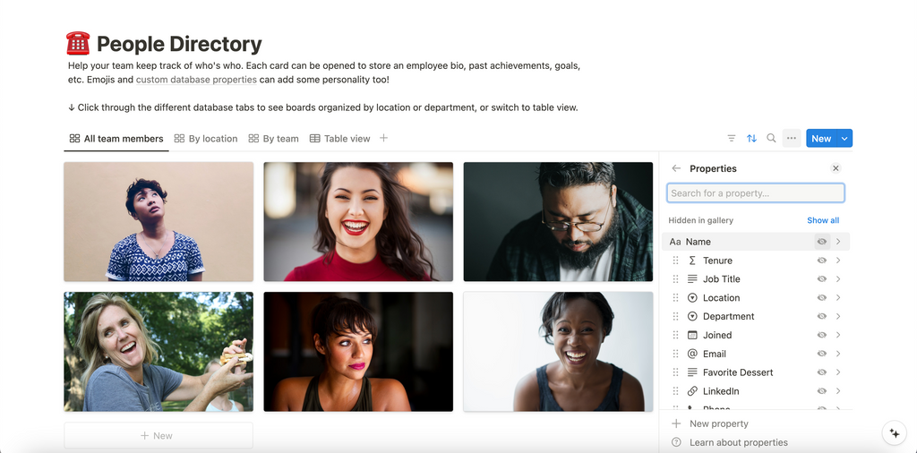
- Team Directories: This feature is often used to create and maintain comprehensive directories of team members, including their roles, contact information, and photographs. It helps in fostering better communication and collaboration within the team.
- Mood Board: A mood board in Gallery View allows designers and creatives to curate a collection of images, colors, and textures that convey the desired aesthetic or concept for a project. It serves as a visual guide and source of inspiration.
- Brand Assets: Gallery View is also widely utilized to organize and display brand assets such as logos, typography, imagery, and other visual elements. This makes it easier for team members to access and use consistent branding materials in their work.
- Notebooks & Journals: The gallery view provides an excellent way to visualize and organize the various themes of your notebook.
On the other hand, if it is just a simple few images, we recommend you to add Simple Images. You can upload an image or use an embed link. This is useful for displaying individual images within your text.

Tip 3: Set up Card Preview
In Notion's gallery database, the "Card Preview" feature allows you to customize what appears on your gallery cards. To access this feature, click the three dots in the top right corner of your database, select "Layout," and then "Card Preview." Here, you have several options to choose from:
- None: This option hides all previews, displaying only the title or other properties
- Page Cover: If you choose this option, the cover photo you have added to the page will appear as the preview image on the gallery card.
- Page Content: This option shows a snippet or preview of the content within the page, providing a quick overview without needing to open the page.
- Files & Media: By adding a property for files and media, you can unlock an option to display these files as cover photos. Upload an image, and it will automatically appear as the cover photo in your gallery view.

Using the "Page Cover" option is particularly useful for visual projects like design portfolios, mood boards, or any scenario where an image provides significant context. Conversely, "Page Content" can be beneficial for text-heavy projects where a brief preview of the content helps users decide which pages to open.
Tip 4: Adjust Card Size
Adjusting the card size in gallery view is highly useful as it allows you to control the amount of detail displayed in each image. Depending on your needs, you can choose between small, medium, or large card sizes to better fit the visual context and amount of information you want to present. This customization helps in making your gallery more functional and aesthetically pleasing.

Tip 5: Wrap All Properties
The "Wrap All Properties" feature ensures that all properties associated with each gallery card are fully visible, wrapping text as needed. This is beneficial for displaying detailed information without truncation. To enable this, go to the three dots, select "Properties," and toggle on "Wrap All Properties." These feature helps in maintaining the visual appeal and functionality of your gallery view, making it easier to present and interpret your data.

Tip 6: Hide Card Titles for a Clean Gallery Look
For a cleaner and more streamlined appearance, you have the option to hide the titles of your gallery view databases. To do this, first click on the three dots located at the top right corner of the gallery view. Next, navigate to the "Properties" section. In this menu, you will find various options for customizing the display of your database. Locate the name property and simply toggle it off. This small adjustment can significantly enhance the visual appeal of your gallery view, making it look more organized and less cluttered.

Tip 7: Fit Image & Reposition Images
If you enable the "Fit Image" option in the "Layout" settings, you will be able to display the exact image size you uploaded, ensuring that the dimensions remain true to the original file. Additionally, you have the flexibility to drag and reposition images within the layout to fit your preferences and design requirements, allowing for a more customized and precise arrangement.

Tip 8: Useful Properties in Gallery View
The properties below will help you visualize items within the gallery view. For the main view, we recommend displaying 2-3 properties to ensure an aesthetic and easy navigation of the gallery.
- Tags: Tags can help categorize and filter your entries, making it easier to find specific items quickly.
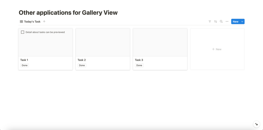
- Checkboxes: Checkboxes can be used to track the completion of tasks or to-do items within your gallery, which is useful for project management or tracking progress.
- Text Properties: Adding text fields allows you to include additional information or notes that are important for each entry, providing context without cluttering the main view.
- Date Properties: Useful for tracking timelines and deadlines, you can add start and end dates for each entry, which is beneficial for project planning and scheduling.
- Files and Media: This property allows you to attach relevant documents, images, or other media files directly to your gallery entries, making it a comprehensive and organized repository for your projects or collections.
Tip 9: Master how to group, filter, and sort
You can group your gallery entries by tags or other properties for better organization. Sorting and filtering options are also available to help you manage your gallery view efficiently.
Grouping
Grouping entries in a gallery view helps to categorize and organize your data effectively. To group entries, click on the "Group" button at the top of your gallery view. You can group by any property, such as tags, dates, or any custom property you've added to your database. This feature allows you to visually segment your entries, making it easier to navigate and manage your data.
Filtering
Filtering is a powerful tool for narrowing down the entries displayed in your gallery view. To apply a filter, click on the "Filter" button at the top of your gallery view. You can set conditions based on any property, such as showing only entries with specific tags or within a certain date range. Filters help you focus on the most relevant entries, improving your workflow and productivity.
Sorting
Sorting entries in your gallery view allows you to arrange them in a specific order. Click on the "Sort" button at the top of your gallery view to choose the property by which you want to sort. You can sort entries in ascending or descending order based on properties like names, dates, and categories. Sorting helps you prioritize entries and find what you need more quickly.

Tip 10: Be creative with Gallery View!
The flexibility of gallery views encourages experimentation, as there are no strict rules on how they should be used. You can also use Gallery View to display items in your list and add buttons to. Configure buttons to perform actions like checking off a to-do item or adding a page to another database.
By trying different configurations and layouts, you can discover unique and creative ways to present your content!

Excited to learn more about Gallery in Notion?
Gallery view in Notion offers a versatile and visually appealing way to organize and display your content. Whether you're showcasing journal covers, project databases, or photo galleries, these tips and tricks will help you make the most of this feature.
If you are eager to learn more through real-life examples, we strongly recommend you watch our tutorial for a comprehensive, step-by-step video guide below on making the best out of this functionality in Notion. To learn more, read more in Notion’s Official Guide here.